
Sunday, June 30, 2013
Amanda Holloway
Amana Holloway's photographs focus mainly on senior portraits. I discovered her pictures while searching for portrait ideas and really liked her style. Some of them I think could even be considered model photography. This image particularly stood out to me because of its focus on the face and its use of color. I think the eye make up is just a bit too heavy and distracts from the eyes themselves, but the face is cleaned up nicely and the colors are very natural. I like how it fades around her face but her hair to the right is still in focus.
More work at: http://www.amandahollowayphotography.com/
Heather Anne Campbell
This picture by Heather Anne Campbell is of the Arno River in Florence, which I found on the National Geographic site. It really stood out to me due to the gloomy atmosphere and the dull grays and blues. Also the expanse of sky and the reflection of the bridge in the water creates a nice composition. Our eyes are drawn to between the bridges, and then the dark figures crossing over it. There is just enough buildings on the edges to give us a sense of depth.

Jonny MP
Jonny MP Photography is a company that focuses on portraits, especially family and wedding photos. I like the orginality of this image, along with its vertical display. It's interesting how the main focus is down at the bottom and slightly to the left, but our eyes are still drawn to the two thirds point with the falling leaves over head. I like how the background is heavily blurred, so it does not distract from the subject. I also like how the little boy is wearing blues, which contrasts nicely with the red hues of the leaves.

More work at: http://jonnymp.com/
Hartmut Nörenberg
This is one of my newest favorite photographers, which I discovered while searching for "face" portrait photography. Most of his work is facial or fashion related, and deals a lot with retouching. I think this is a fine example of an image being advertisement worthy. The skin is smooth, the color is natural, and the lighting is warm. I also like the angle of the image, head tilting back and down to the side, eyes shut, hair styled strangely but still very eye catching.

More work at: http://www.hart-worx.com/en/
Saturday, June 29, 2013
Renne Robyn
Renne Robyn had a lot of fashion and underwater photography. There's a lot of intensity in most of the images, but this one stood out specifically. I think it might be partially due to its horizontal angle, since most fashion and advertisements are vertical. I also think it was because of the color scheme, very soft with the light browns and blues. It does feel photoshopped but as far as editing towards the face is concerned, it looks professionally done. I also like the tilt of the face and the direction of the eye line.

More work at: http://reneerobynphoto.500px.com/
Vanessa Salas
Vanessa Salas' photography I also came across while searching for model photos. I really liked her Fairy Tale collection. All the images had a soft, fantasy like quality to them. This was my favorite of the collection. I like how the front has a more blurred appearance and how the figure is off center. The lighting on her face is very effective and while the background is busy, it isn't distracting since it helps create a story for the image. Also the dark blues and greens are a nice contrast against her cream colored gown. I also like that we cannot see her eyes, but yet are drawn in by her facial expression, the downward tilt leading us to her hand and the spinning wheel.
 More work at: http://www.flickr.com/photos/lamualfon/
Sergey Karpenko
Sergey Karpenko is another model photographer, and I really liked this image's focus and use of the color. The warmth of the red is beautifully contrasted against the warm golden browns of the background, hair, and skin. I also like how the figure is looking off past the viewer, like they are deep in thought and the surroundings are blurred just enough to create a very soft looking image, the face being the focus of our attention. It does feel just a little bit noisy, though, which is distracting.

More work at: http://piccsy.com/2011/11/photography-by-sergey-karpenko-ad1ekdoyp/
Alvar Astulez
Alvar Astulez's photography is more landscape oriented. I like this one due to its contrasting colors from the warmth of the red to the cool of the greens and blue hues up at the top. I like how the picture has a sense of depth from the way the forest fades into the background with the heavy mist and blinding sunlight. I think the tree might have stood out better if they weren't as so heavily shadowed.

More work at: http://www.flickr.com/photos/jesuscm/6406370417/
More work at: http://www.flickr.com/photos/jesuscm/6406370417/
Friday, June 28, 2013
Sharon Johnstone
Sharon Johnstone's works are more nature focused, with many examples of fine macro photography. I especially like this one due to its warm, sunny colors and its focus springing from the left side rather than from the bottom. Part of the dandelion is blurred so that we are drawn to the water droplets. The background is also nicely shadowed the further you go down. I feel as though the slight tinges of blue in the water droplets could have been repeated in the background somehow to make them pop out more.
 More work at: http://sjfinearts.com/
Zena Holloway
Zena Holloway is also known for her advertisement photography, especially her underwater photos, which I found extremely interesting. While some of her work is clearly photoshopped, I like the concepts. I like this one specifically because of the dark background and the light colors on the model and her dress. There's such movement in this image and a strange otherworldly feeling. I like how the figure almost has a heart shape to them, and how the bottom of the dress is more shadowed and blue while the upper part is a light brown and not quite so darkened. I think it might have been better with stronger lighting on her face.

More work at: http://www.photizm8.co.uk/zena/
More work at: http://www.photizm8.co.uk/zena/
Joanna Kustra
I found this photo by Joanna Kustra when looking up ideas for portrait/model photo shoots. I really liked the red and blue contrasts throughout this image and the sharpness of her facial features. I like that the head is tilted but the eyes are still directed forward, though not in an intimidating manner. I feel as though there are traces of faint freckles on her face and would have liked to have seen them brought forward more. I do like how the red hues of her hair and the blues of the background are enhanced by the lighting against her skin.
More work at: http://www.joannakustra.com/
 |
| Image from: http://pinterest.com/pin/553239135445261578/ |
More work at: http://www.joannakustra.com/
Wednesday, June 26, 2013
Sebastian Kim
Sebastian Kim's photography focuses mainly on fashion, and more specifically, advertisements. I discovered his work recently when researching advertising and photography examples for my own assignments. I find this piece stands out due to its simple but cool color scheme. I like how the model is facing the viewer, but the head does feel ever so slightly tilted, and the body is leaning forward, creating nice shadowing along her right side contrasted nicely against the light coming from what feels like an open window. I do feel as though her eyes could have stood out more.

More work at: http://www.sebastiankim.com/
Monday, June 24, 2013
Antony Spencer
I like this photo by Antony Spencer because of the sense of depth you get from the unending row of vivid purple flowers, stretching off into the horizon and mist. The colors are beautifully offset by the rising sun and the pink hue in the clouds. I like the angle of this photo, though I might have appreciated it more if it was taken a bit lower, to make you feel level with the flowers. I also think it would have stood out better if it didn't have a dark fade in the two upper corners.
 |
| Image from: http://bp4.uuuploads.com/landscape-photography/landscape-photography-15-large.jpg
More work at: http://1x.com/member/antonyspencer
|
Saturday, June 22, 2013
Maria Helena Buckley
This photo was taken by Maria Buckly and I really like the subtle, warm, earthy colors, especially in the skin tones and the backgrounds. I like how the focus is on the center ballerina, and that she's turned away from us, giving her a very contemplative expression. I also think the lighting being behind her, creating shadows on her back, creates a more interesting image. The fade, with the appearance of mist in the background, is very well done and not too abrupt. Also the expression on the ballerina to her right catches your attention and leads you into the background more.
 |
| Image from: http://photography.nationalgeographic.com/photography/photo-of-the-day/ballerinas-berlin/ |
More work at: http://yourshot.nationalgeographic.com/profile/10416/
Tuesday, June 18, 2013
Thomas Young
This picture was taken by Thomas Young, featured in a National Geographic contest. I liked the vividness of this image, which was one of the reasons I picked it. The sky was another part that stood out to me, since it's a cloudy day but not too cloudy that the sky is completely dull or gray. There is a slight glare from the sun in the lower portion of the sky but it didn't bother me too much. The grass has such texture and appears more golden than a dead brown. I also like how the church is situated towards the left and not straight back.
 |
| Church of the Good Shepherd, South Island, New Zealand Image from: http://travel.nationalgeographic.com/travel/countries/new-zealand-photos/#/new-zealand_6022_600x450.jpg
More work at: http://yourshot.nationalgeographic.com/profile/83420/
|
Wednesday, June 12, 2013
Thomas Kettner
Again, we have another photographer that focuses mainly on fashion and beauty advertisements. I like this one, though, due to the darkness and the vintage feel. It has got a nice violet tint to it and even though her face is particularly dark with shadows, it is offset by the glow of light against her hair. I think her jewelry looks a bit fake since it's not quite as dark as the rest of her. I do like the subtlety of the smoke rising to the right and the hints of her veil against the dark.

More work at: http://www.thomaskettner.com/

More work at: http://www.thomaskettner.com/
Florian Ritter
Even though the sky is very bright, I think it works well with this particular image. It has a very warm, golden glow to it, which accents the oriental somewhat mystic feel I get from the traditional lanterns and rooftops, making it feel unearthly. I like how the stony path, with the sunlight reflecting off of it, winds downwards and disappears from sight amongst the buildings, giving this image depth and making the viewer feel rather up high in comparison. I like the warmth of the colors, though some of the shadows among the buildings feel a bit too dark.
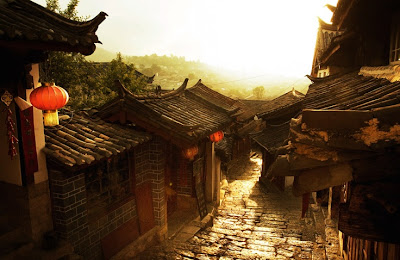

More work: http://www.pflock.com/
Simon Powell
A lot of Simon Powell's photos are used for fashion and advertisement, and we get this feel from this photo. I like how the colors are toned down, even the red, which still does stand out, but it's more subtle. I think it might have been more effective if she had been turned slightly to her left, so more lighting cut across her than it does. Also I think if the camera had been angled it might have been more interesting than looking at her straight on. The straight on focus does make you notice the reds, and the Coco-Cola, but other than, it's very simple. Adjustments in the levels might have made this stand out better.


More work at: http://www.simonpowell.net/
Zhang Jingna
This is one of those images that I think might work better with a more solid background, particularly one a bit darker if the figure where to have more hilights especially in his jacket. Though since he is so dark, perhaps a lighter background would have been best. It's just a bit distracting having that section of light on his left when the rest of the background is dull grey or darker. I do think the lighting is perfect against his face and the violin. I also like the movement that picture presents. I do feel that his hair is a bit blurred compared with the rest of him, but I am drawn to his calm, but somewhat saddened facial expression.

More work: http://www.zhangjingna.com/

More work: http://www.zhangjingna.com/
Xavier Fargas
I've taken a similarly angled photo before with a bench, and this gave me some ideas if I were to attempt this again. I like how the bars of the bench are directed towards the other bench in the background, and I also like how the background is light with fog and how all the tree branches snake out into the sky. The figure farthest in gives this image a slightly eerie edge, which makes it that much more engaging. I don't think I would have blurred the background anymore than it all ready is, but I might have darkened some of the trees so they would have stood out more.

More of his work: http://www.xavierfargas.com/
Will Pearson
Will Pearson's panoramas are some of the most interesting ones I've found. I selected this image firstly because of the location, with the easily recognizable ferris wheel, the London Eye. I also selected it due to the colors, which immediately caught my eye. I love the contrast between the orange ish hue due to the rising or setting sun against the stormy blue sky and reflection in the water. I think the ferris wheel might have been better off slightly to the side, and it would still have been the focus of the image since it's the tallest and most interesting part of the picture.
 |
| Image from: http://www.willpearson.co.uk/portfolio_cityscapes.php |
More work at: http://www.willpearson.co.uk/
Phillip Klinger
Philipp Klinger's photos I discovered on a whim and this one caught my attention immediately. I've always liked pictures of staircases or older looking buildings. I'm not positive what it is a photo of but it feels like an abandoned airport or subway staircase, or even one from a mental institution. I like the blue tint to the image, which isn't too distracting and makes the grays in the picture less dull, and also creates more of a story setting, since it intensifies the creepy factor.
More of his work: http://www.klinger-photography.com/index.html
 |
| Image from: http://www.klinger-photography.com/portfolio-architecture-1.html |
More of his work: http://www.klinger-photography.com/index.html
Benoit Courti
Benoit Courti is one of my most recent favorite photographers and it was hard selecting an image. I love how he focuses mainly on black and white, and I find photos with pure black backgrounds striking and eye catching. While many of his object photos interest me, I selected this portrait. I like how it focuses on only one side of the face, that striking contrast between darkness and light. I also like how the eye is the focus and is looking straight at the viewer. Having the hand blurred also makes the eye stand out even more. The attitude in the subjects face accented by their arched eyebrow makes the piece even more interesting. I think the only thing I would have touched up is her hair on the right, because it doesn't stand out as well as the rest of that side of the face.
More of his work: http://benoitcourti.4ormat.com/
 |
| Image from: http://benoitcourti.4ormat.com/portraits |
More of his work: http://benoitcourti.4ormat.com/
Victoria Ivanova
Many of Victoria Invanova's photos are clearly photoshoped, but they are still very strange and interesting. She takes inanimate objects and creates a scene or tells a story. I find this one engaging, since it appears as though the clothespins grow on trees and must gather each other down from the branches. The light striking against the back wall seems too obvious to me, too fake, and I think it would have stood out better with a purely dark background. The light does make your eyes move down to the focus of the image, the little clothespin climbing the ladder, but it creates a grainy effect on the stones.
For more of her work: http://500px.com/Victoria_Ivanova
 |
| Image from: http://500px.com/photo/11740905 |
For more of her work: http://500px.com/Victoria_Ivanova
Tuesday, June 11, 2013
Alfred Eisenstaedt
Alfred Eisnstaedt is most well known for his V-J Day photo, with the kissing couple. I was attracted to his ballet photos more, due to not only the subject but the delicacy of these images. This one interests me further because I feel there is a story behind this one. Three of the ballerinas are staring out the window, while the fourth looks indifferent. It makes me wonder what they're looking at and what they're thinking about it. I also feel drawn to the girl farthest to the left. The light is striking across her more prominently than the others, and she is the only one with her face in the light. I don't think the light background is a distraction since the room appears darker and they're all shadowed, but not too much. It also makes the words on the window look more striking, and makes me want to know what it says.

For more of his work: http://life.time.com/alfred-eisenstaedt/
Monica Denevan
Monica Denevan's photos focus on more natural settings and places such as Burma and China. I truly like the simplicity of this photo, and while the back ground and sky are both duller and lighter, I like how the figure stands out by being heavily shadowed. Also, their skin is naturally dark and the shadow of their arm along with the boat stand out better on the lighter water. There isn't much going in the background, minus some of the grass, so you are not distracted from the figure, or their bent arm, which feels like the focus of this image to me. Maybe a bit more lighting on their left side could have improved this, to match the lighting on that side of the boat.
 |
| Image from: http://monicadenevan.com/photographs/burma/ |
More of her work: http://monicadenevan.com/
Lois Greenfield
Louis Greenfield's photography is another that focuses mainly on dance, and some has been used in advertisements. Most of his work is very engaging, with the dancers always having a sense of movement in his photographs. I like how this one in particular stands out. The contrast between the figure and the dark background, like Richard Calmes' example, makes him and the powder pop out. I also like how it's taken from the side instead of face on, and that his arms are moving in two different directions. The figure also has just enough lighting and shadows, accentuating his muscles, without making him look too gray.
 |
| Image from: http://www.loisgreenfield.com/galleries/airborne/index.html |
More of his work: http://www.loisgreenfield.com/index.html
Paul Morel
Paul Morel's photography focuses more on fashion, but this portrait stood out to me more than most of his other works. I think the close up has more of an effect on the viewer, and it's cropped just so that there's not tension around the head. I like how it lacks symmetry, with her head tilted slightly towards the side, her hair falling in front of her face, and the way in which she's biting at her lip. I think it might have had a better focus if her eye makeup wasn't so heavy since I find myself looking between that, the water dripping from her hair, and her mouth. I do think that the lighter background works well since she is heavily shadowed and her hair is dark. I would have edited out the strands of hair in the lower right since it's a distraction.
 |
For more of his work: http://www.paulmorelstudios.com/portrait.html
Richard Calmes
Richard Calmes is known for his stunning photography of ballet performers. This is one of my favorites of his works. Most of his work is not strictly black and white, but I love how in many of his photographs he uses silhouettes to get the image across to the viewer. This one particularly stood out to me since the subject is low, surrounded by a black background. The lighting and shadows on the dancer also caught my eye, along with the details in the design of her tutu. I also think that the positioning of her limbs creates stunning angles that make you continuously look over the image. My only criticism is that her face is too dark, and could have been more engaging if the shadows were only on one side of the face or if her head had been raised up into the light a few inches.
 |
| Image from: http://www.pbase.com/rcalmes/image/133052591 |
For more of his work, visit: http://www.richardcalmes.com/
Sunday, June 9, 2013
Ansel Adams
 |
| Image from: http://en.wikipedia.org/wiki/Ansel_Adams |
 |
| Image from: http://shop.anseladams.com/Grand_Canyon_Bright_Angel_Canyon_p/1901016.htm |
His photographs stand out so well because they capture such amazing landscapes, even without the use of color. I also appreciate how it's cropped off most of the sky, focusing on the vastness of the land, and how the light and shadows make it stand out to the viewer. What draws my attention first is the dark crevice cutting diagonally across the image, which is much more interesting than a straight vertical or horizontal line. I think the only aspect that would have made this image more stunning is if it had been a cloudy day, and therefore more shadows, but I find it hard to criticize his amazing photographs.
More of his work can be found here: http://www.anseladams.com/

Subscribe to:
Posts (Atom)